
Responsive Column Layouts
Posted on January 23, 2013 at 11:57 am
Typically, to create a column layout, you would need to add the first or last classes to reset the margin space and clear the float. Today I’m going to share a very simple CSS trick to create a responsive column layout using nth-of-type pseudo class. I use this trick to code the WordPress themes at Themify. It doesn’t require any first or last class and the number of columns can be adjusted base on the viewport. In other words, it can be toggled from 4-column to 3-column or 2-column, etc.
View Demo Responsive Column/Grid
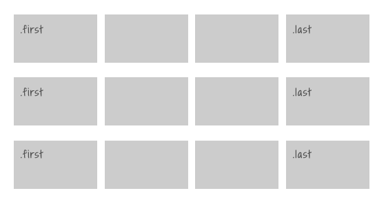
The Inconvenience of Using The First & Last Classes
Normally we would add a .first or .last class to clear the margin space and float in the grid. Adding the first and last class is very tedious, not to mention that it gets more complicate if you need to make it responsive.
Using nth-of-type
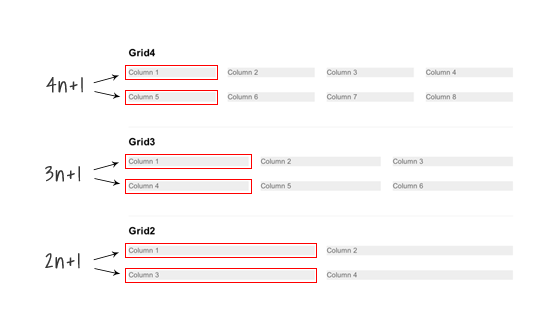
The :nth-of-type(An+B) expression makes it very easy to clear the float and margin without having to add .first or .last class. For example:
- .grid4 .col:nth-of-type(4n+1)= target every 4th .col element, starting from the first
- .grid3 .col:nth-of-type(3n+1)= target every 3rd .col element, starting from the first
- .grid2 .col:nth-of-type(2n+1)= select every 2th .col element, starting from the first
.grid4 .col:nth-of-type(4n+1),
.grid3 .col:nth-of-type(3n+1),
.grid2 .col:nth-of-type(2n+1) {
margin-left: 0;
clear: left;
}
Making it Responsive With Media Queries
To make it responsive and fluid, use percentage value instead of pixel value.
/* col */
.col {
background: #eee;
float: left;
margin-left: 3.2%;
margin-bottom: 30px;
}
/* grid4 col */
.grid4 .col {
width: 22.6%;
}
/* grid3 col */
.grid3 .col {
width: 31.2%;
}
/* grid2 col */
.grid2 .col {
width: 48.4%;
}
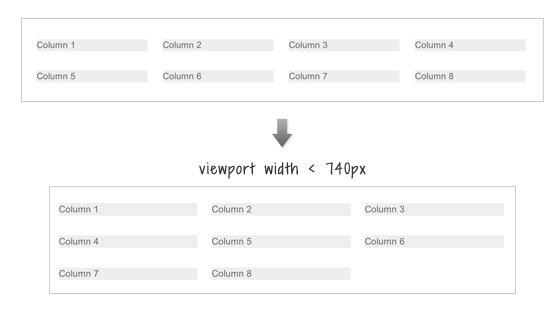
Changing From 4-column to 3-Column
To change the 4-column to 3-column on viewport width that is less than 740px:
- change the .grid4 .col width to 31.2% (one-third width)
- reset the left margin and clear property
- then re-apply the left margin and clear property using nth-of-type(3n+1) to form a 3-column grid
@media screen and (max-width: 740px) {
.grid4 .col {
width: 31.2%;
}
.grid4 .col:nth-of-type(4n+1) {
margin-left: 3.2%;
clear: none;
}
.grid4 .col:nth-of-type(3n+1) {
margin-left: 0;
clear: left;
}
}
Changing 4-column and 3-column to 2-column
To switch the 4-column and 3-column to 2-column on viewport width that is less than 600px: basically use the same trick as above to reset the .col width and float.
@media screen and (max-width: 600px) {
/* change grid4 to 2-column */
.grid4 .col {
width: 48.4%;
}
.grid4 .col:nth-of-type(3n+1) {
margin-left: 3.2%;
clear: none;
}
.grid4 .col:nth-of-type(2n+1) {
margin-left: 0;
clear: left;
}
/* change grid3 to 2-column */
.grid3 .col {
width: 48.4%;
}
.grid3 .col:nth-of-type(3n+1) {
margin-left: 3.2%;
clear: none;
}
.grid3 .col:nth-of-type(2n+1) {
margin-left: 0;
clear: left;
}
}
Making all columns Fullwidth (see demo)
To make all columns to full width on viewport width that is less than 400px: set width to 100% and reset the margin and float.
@media screen and (max-width: 400px) {
.col {
width: 100% !important;
margin-left: 0 !important;
clear: none !important;
}
}
Internet Explorer Issues
Both media queries and nth-of-type are not supported by Internet Explorer 8 or older. You can use selectivizr.js to provide nth-of-type support for IE and respond.js for media queries. Unfortunately, selectivizr.js and respond.js don’t work well together (ie. nth-of-type doesn’t work within the media queries). This means the only fall back with this responsive grid is that the columns can not be switched from 4-column to 3-column or 2-column.
Posted in Web Design